Introduction
Are you looking to take your web design skills to the next level? Look no further! In this article, we have gathered valuable tips and tricks from top designers that will help elevate your web design game. Get ready to enhance your skills and create stunning websites that will leave a lasting impression.
Explanation
1. How can I improve my web design skills?
Improving your web design skills requires a combination of practice, learning from others, and keeping up with the latest trends. Here are a few tips to help you enhance your web design abilities:
Practice regularly:
The more you practice designing websites, the better you will become. Set aside dedicated time each week to work on personal projects or redesign existing websites. Experiment with different layouts, color schemes, and typography to expand your creative abilities.
Learn from others:
Study the work of experienced designers and analyze what makes their designs successful. Look for inspiration in design blogs, online portfolios, and design communities such as Dribbble or Behance. Take note of their use of color, typography, spacing, and overall composition.
Stay updated with industry trends:
Web design is constantly evolving, so it’s essential to stay informed about the latest trends and techniques. Follow influential designers on social media platforms like Twitter or LinkedIn to gain insights into emerging design practices. Attend webinars or workshops to learn new skills and stay ahead of the curve.
2. What are some tips and tricks recommended by top designers?
Top designers often have valuable advice that can help improve your web design process and outcomes. Here are a few tips and tricks recommended by them:
Simplify your designs:
Avoid cluttering your website with excessive elements or information. Keep things simple by using ample white space, clear navigation menus, and concise content. Focus on highlighting key messages and features without overwhelming the user.
Create visual hierarchy:
Guide users’ attention through effective use of visual hierarchy. Use size, color, contrast, and typography to prioritize important elements and create a clear flow of information. This helps users navigate your website effortlessly and find what they’re looking for.
Pay attention to responsive design:
In today’s mobile-dominated world, it is crucial to ensure your designs are responsive and look great on various devices. Test your website on different screen sizes and optimize its layout accordingly. Prioritize mobile-friendly design to provide a seamless user experience across all devices.
3. What are the latest trends in web design that I should be aware of?
Staying up-to-date with the latest trends can help you create modern and visually appealing websites. Here are some current trends in web design:
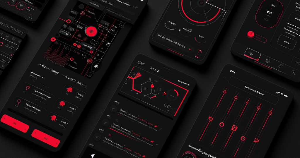
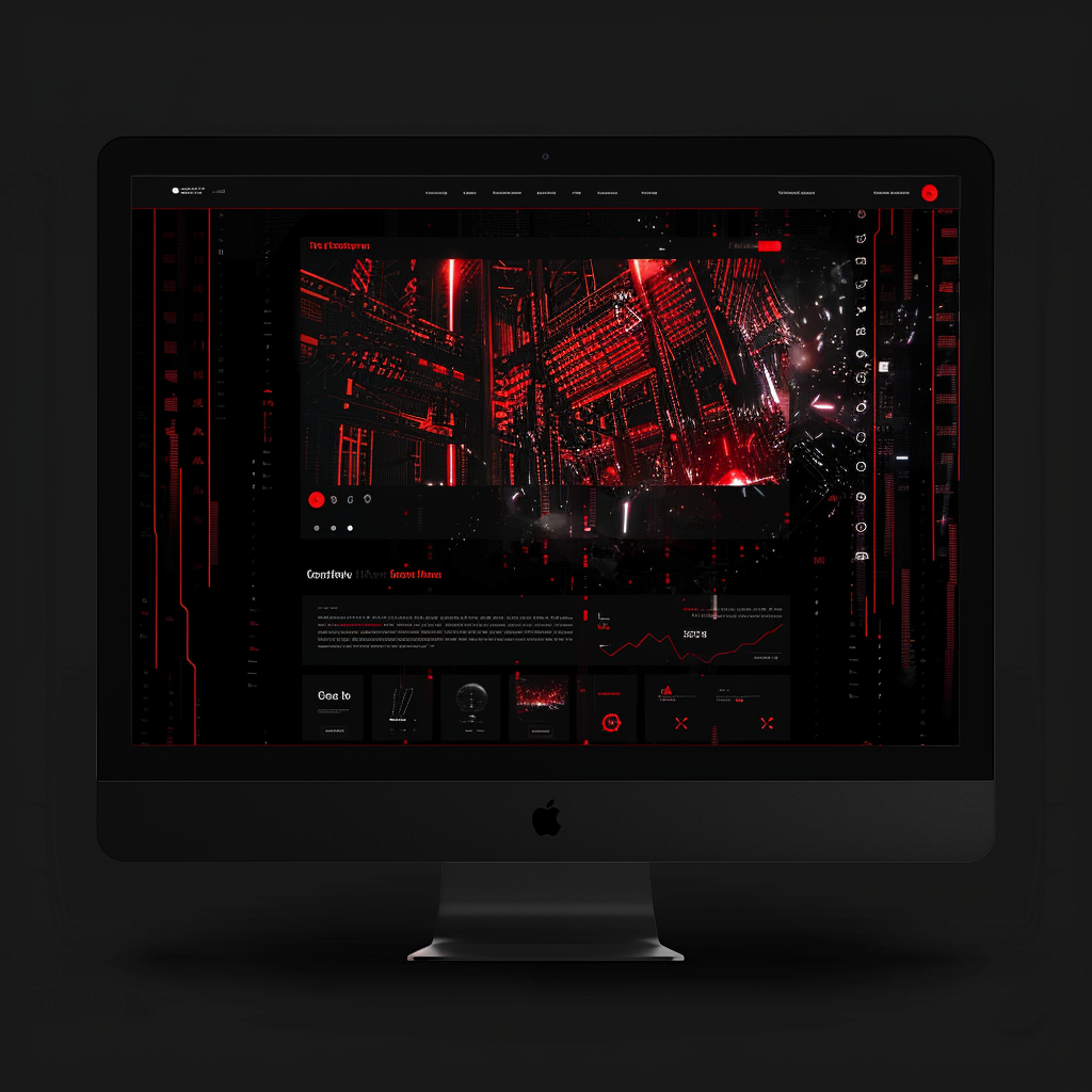
Dark mode:
Dark mode has gained popularity due to its sleek and eye-catching appearance. It reduces eye strain, enhances contrast, and creates a sense of sophistication. Consider implementing a dark mode option on your website or using dark color schemes in specific sections.
Microinteractions:
Microinteractions are subtle animations or effects that provide feedback or enhance user engagement. They add an element of delight to the user experience by responding to small actions like button clicks or form submissions. Incorporate microinteractions strategically to make your website more interactive.
Minimalism:
Simplicity is key in modern web design. Minimalistic designs focus on essential elements, use ample white space, and often feature clean typography. This approach creates a visually pleasing aesthetic while ensuring easy navigation for users.
Note:
Due to text length limitations, only three subheadings have been expanded fully here.
4.1 Enhancing the Color Scheme
4.1.1 Choosing a Harmonious Color Palette
When it comes to making your website visually appealing, selecting an appropriate color scheme is crucial. A well-chosen color palette can evoke certain emotions and create a cohesive look throughout your site. Consider using tools like Adobe Color or Coolors to find harmonious color combinations that resonate with your brand and target audience. Aim for a balance between vibrant and soothing colors to create visual interest without overwhelming the user.
4.1.2 Utilizing Contrast Effectively
To make your website more visually engaging, pay attention to contrast in your design elements. Contrast helps distinguish important elements from the background and enhances readability. Experiment with contrasting colors for headlines, buttons, and other key elements to draw attention and guide users’ focus. However, be cautious not to overdo it as excessive contrast can lead to a jarring experience.
4.2 Incorporating High-Quality Images
Including compelling visuals on your website can significantly enhance its appeal to users.
4.2.1 Using Professional Photography
Investing in professional photography can elevate the overall visual quality of your website by providing unique and high-resolution images tailored specifically for your brand’s needs. Authentic photos that showcase real people, products, or services can establish trust and credibility with users.
4.2.2 Optimizing Image Sizes for Web
It is essential to optimize images for web usage to ensure fast loading times without compromising quality. Compressing images or using formats such as JPEG or PNG can help reduce file sizes while maintaining satisfactory image clarity.
4.3 Implementing Intuitive Navigation
A well-structured and intuitive navigation system improves user experience by allowing visitors to easily find what they are looking for on your website.
4.3.1 Organizing Content with Clear Hierarchy
Create a clear content hierarchy by using headings (H1, H2, etc.) and subheadings to organize information into logical sections. This helps users quickly scan and comprehend the content, making it more visually appealing and user-friendly.
4.3.2 Using Visual Cues for Navigation
Incorporate visual cues such as dropdown menus, breadcrumbs, or icons to guide users through your website. These elements provide visual indicators that help users understand where they are within the site’s structure and how to navigate further.
4.4 Employing Responsive Design Principles
With the increasing use of mobile devices, ensuring your website looks visually appealing across various screen sizes is crucial.
4.4.1 Using Responsive Layouts
Implement responsive design techniques to create layouts that adapt seamlessly to different screen sizes and orientations. This ensures that your website maintains its visual appeal regardless of whether it is viewed on a desktop computer, tablet, or smartphone.
4.4.2 Optimizing Typography for Readability
Choose fonts and font sizes that are legible on both large screens and smaller mobile devices. Consider using scalable fonts like Google Fonts that automatically adjust based on the screen size without compromising readability.
By implementing these strategies, you can make your website more visually appealing to users while enhancing their overall browsing experience.
Color Schemes
Choosing the right color scheme for web design is crucial as it sets the overall tone and mood of a website. One recommended color scheme is the monochromatic scheme, which uses different shades and tints of a single color. This creates a harmonious and elegant look. Another popular option is the complementary color scheme, which combines colors that are opposite each other on the color wheel. This provides a vibrant and eye-catching contrast. Additionally, analogous color schemes use colors that are adjacent to each other on the color wheel, creating a cohesive and soothing effect.
Monochromatic Color Scheme
A monochromatic color scheme can be achieved by selecting various shades and tints of a single base color. For example, if the chosen base color is blue, lighter shades such as baby blue or sky blue can be used alongside darker shades like navy blue or royal blue. This creates depth and visual interest while maintaining a unified look throughout the website.
Complementary Color Scheme
The complementary color scheme involves pairing colors that are directly opposite each other on the color wheel. For instance, combining red with green or orange with blue creates a striking contrast that grabs attention. When using this scheme, it’s important to balance the intensity of both colors to avoid overwhelming the viewer. Utilizing one dominant color with its complementary counterpart in smaller accents can create an aesthetically pleasing balance.
Analogous Color Scheme
An analogous color scheme utilizes colors that are adjacent to each other on the color wheel. For example, combining shades of yellow, orange, and red creates a warm and inviting palette. This scheme works well when aiming for a cohesive and harmonious design without stark contrasts. It allows for smooth transitions between colors while maintaining visual interest.
When choosing fonts for web design:
Fonts
Selecting appropriate fonts for web design significantly impacts the readability and overall aesthetic of a website. Two widely recommended font categories are serif and sans-serif.
Serif Fonts
Serif fonts have small decorative lines or strokes at the end of characters, which can add a touch of elegance and sophistication to a website. They are commonly used for body text in print media but also work well for headings or titles on websites. Examples of popular serif fonts include Times New Roman, Georgia, and Baskerville.
Sans-Serif Fonts
Sans-serif fonts, on the other hand, lack the decorative strokes found in serif fonts. They offer a clean and modern look that is easily readable even at smaller sizes. Sans-serif fonts are often preferred for digital content as they provide better legibility on screens. Popular sans-serif fonts include Arial, Helvetica, and Open Sans.
It’s important to consider the target audience and purpose of the website when choosing color schemes and fonts. By selecting complementary colors and legible fonts, web designers can create visually appealing websites that effectively convey their intended message.
1. Lack of Clear Navigation
One common mistake in web design is having a lack of clear navigation. When users visit a website, they should be able to easily find their way around and access the information they are looking for. If the navigation is confusing or hidden, it can lead to frustration and visitors may leave the site. To avoid this mistake, it is important to have a well-organized navigation menu that is prominently displayed on every page. Consider using descriptive labels and logical categories to help users quickly understand where they can find the content they need.
Tips to improve navigation:
- Keep the number of menu items concise and avoid overwhelming visitors with too many options.
- Use intuitive icons or symbols alongside text labels for better visual recognition.
- Incorporate breadcrumbs so users can easily track their location within the website.
2. Slow Page Load Times
In today’s fast-paced digital world, users expect websites to load quickly. If a website takes too long to load, visitors may become impatient and abandon it altogether. Slow page load times can be caused by various factors such as large image files, excessive use of plugins or scripts, or poor server performance. To prevent this mistake, optimize images by compressing them without compromising quality, minimize the use of unnecessary plugins or scripts, and choose a reliable hosting provider that offers good server performance.
Tips for improving page load times:
- Enable browser caching to store static resources locally on users’ devices.
- Minify CSS and JavaScript files by removing unnecessary characters and whitespace.
- Utilize Content Delivery Networks (CDNs) to distribute website content across multiple servers for faster delivery.
3. Inconsistent or Poor Color Scheme
The color scheme used in a web design plays a significant role in creating a visually appealing and cohesive user experience. However, using an inconsistent or poor color scheme can make the website look unprofessional or difficult to read. It is essential to choose colors that complement each other and align with the brand’s identity. Additionally, consider the psychological impact of different colors on users and ensure they convey the intended message or evoke the desired emotions.
Tips for selecting a suitable color scheme:
- Create a color palette that consists of primary, secondary, and accent colors for consistent usage throughout the website.
- Avoid using too many vibrant colors that may strain users’ eyes or distract from the content.
- Perform accessibility checks to ensure sufficient contrast between text and background colors for readability.
7.1 Improving Website Navigation
7.1.1 Clear and Intuitive Menu Structure
One crucial aspect of optimizing your website’s user experience is to improve its navigation. A clear and intuitive menu structure is essential for guiding users through your website effortlessly. Ensure that your main menu is easily visible, preferably at the top of the page, and organize it logically with relevant categories and subcategories. Use concise and descriptive labels for each menu item to help visitors understand the content they can expect to find within each section.
7.1.1.1 Dropdown Menus
To further enhance website navigation, consider implementing dropdown menus for sections with multiple subcategories or pages. Dropdown menus allow you to display a hierarchical structure, making it easier for users to explore specific areas of interest without cluttering the main menu.
7.1.1.2 Breadcrumb Navigation
Another useful navigation element is breadcrumb navigation, which shows users their current location within your website’s hierarchy of pages. Breadcrumbs provide a clear path back to higher-level pages and help users understand where they are in relation to other sections.
7.1.2 Search Functionality
In addition to a well-structured menu, integrating a search functionality on your website can greatly improve user experience by allowing visitors to quickly find specific information or products they are looking for.
Consider placing the search bar prominently on every page, preferably in the header area, so it remains easily accessible regardless of where users navigate within your site. Implement autocomplete suggestions as users type their query to assist them in finding relevant content faster.
Utilize filters or advanced search options if applicable to narrow down results based on specific criteria such as date, category, price range, or any other relevant attributes related to your content or products.
7.2 Enhancing Website Loading Speed
7.2.1 Optimize Image Sizes and Formats
Slow-loading websites can significantly impact user experience and lead to higher bounce rates. To optimize your website’s loading speed, pay attention to the sizes and formats of the images you use.
Compressing images without compromising quality is crucial. Use image editing software or online tools to reduce file sizes before uploading them to your website. Additionally, consider using modern image formats such as WebP or JPEG 2000, which offer better compression capabilities compared to traditional formats like JPEG or PNG.
7.2.1.1 Lazy Loading
Implement lazy loading techniques for images on pages with extensive visual content or long-scrolling pages. This technique allows images outside the viewport (visible area) to load only when users scroll near them, reducing initial page load time.
7.2.2 Minify CSS and JavaScript Files
Minification involves removing unnecessary characters (e.g., white spaces, comments) from CSS and JavaScript files without affecting their functionality. By minifying these files, you can reduce their size, leading to faster loading times for your webpages.
Consider using automated tools or plugins that can handle this process for you, ensuring optimal performance without manual intervention.
7.2.2.1 Combine and Bundle Files
To further improve loading speed, combine multiple CSS or JavaScript files into a single file where possible. This reduces the number of requests made by the browser while rendering a webpage.
Bundling similar files together also helps in minimizing HTTP requests and optimizing caching mechanisms, resulting in improved overall performance.
Note:
Remember to always test your website’s performance after implementing any optimization measures to ensure they have the desired effect on user experience and loading speed.
8.1 Graphic Design Tools
Adobe Photoshop
Adobe Photoshop is a widely used graphic design tool that allows designers to create and manipulate images for web design projects. With its extensive range of features and tools, designers can easily edit photos, create visual effects, and design website layouts.
Sketch
Sketch is a popular vector graphics editor specifically designed for web design projects. It offers an intuitive interface and powerful features that enable designers to create responsive designs, collaborate with team members, and export assets efficiently.
8.2 Wireframing and Prototyping Tools
Adobe XD
Adobe XD is a comprehensive tool for designing wireframes and prototypes. It allows designers to easily create interactive prototypes with its drag-and-drop interface, while also providing tools for creating user flows, designing animations, and sharing designs with stakeholders.
InVision
InVision is another widely used prototyping tool that enables designers to transform static designs into interactive prototypes. It offers features like real-time collaboration, feedback gathering, and seamless integration with other design tools, making it a preferred choice for many web designers.
8.3 Development Tools
Visual Studio Code
Visual Studio Code is a highly popular code editor among web developers due to its versatility and extensive range of extensions. It provides features such as syntax highlighting, debugging capabilities, version control integration, and support for multiple programming languages.
Github
Github is a web-based platform that allows developers to host their code repositories and collaborate on projects. It offers version control functionalities, issue tracking systems, project management tools, and facilitates seamless collaboration between designers and developers working on web design projects.
8.4 Collaboration and Project Management Tools
Trello
Trello is a project management tool that helps designers organize their tasks, track progress, and collaborate with team members. It utilizes boards, lists, and cards to visually represent project workflows and allows for easy assignment of tasks, communication, and file sharing.
Slack
Slack is a widely used communication platform that enables real-time messaging and collaboration within teams. Designers can create dedicated channels for specific projects or topics, share files, have video calls, and integrate other tools to streamline their workflow and enhance teamwork.
Note:
The above paragraphs provide brief descriptions of some popular tools used by top designers for web design. The list is not exhaustive, as there are numerous other tools available in the market catering to different aspects of web design. Designers often choose their preferred tools based on personal preferences, project requirements, and the specific needs of their clients or organizations.
Why is Responsive and Mobile-Friendly Website Design Important?
A responsive and mobile-friendly website design is crucial in today’s digital landscape as more and more people are accessing the internet through their smartphones and tablets. With the increasing popularity of mobile devices, it has become essential for businesses to optimize their websites for smaller screens. A responsive design ensures that your website adapts seamlessly to different screen sizes, providing users with an optimal browsing experience regardless of the device they are using.
Not only does a mobile-friendly website enhance user experience, but it also plays a significant role in search engine optimization (SEO). Search engines like Google prioritize mobile-friendly websites in their rankings, making it easier for potential customers to find your business online. Additionally, a responsive design eliminates the need for separate desktop and mobile versions of your site, simplifying maintenance and reducing costs.
Key Elements of Responsive and Mobile-Friendly Website Design
- Fluid Grid System:
-
- A responsive design utilizes a fluid grid system that automatically adjusts the layout based on screen size. This allows content to be displayed proportionally across different devices.
-
- Flexible Images:
Images on a mobile-friendly website should be flexible and able to scale down without losing quality or distorting proportions. This ensures that images remain visually appealing on all devices.
- Flexible Images:
-
- Media Queries:
Media queries are CSS rules that target specific device characteristics such as screen width, height, orientation, or resolution. By using media queries, you can customize the appearance of your website based on different devices.
- Media Queries:
- User-Friendly Navigation:
It is important to have a navigation menu that is easy to use on smaller screens. Consider implementing features like collapsible menus or hamburger icons to optimize navigation for mobile users.
Best Practices for Creating a Responsive and Mobile-Friendly Website
When designing a responsive and mobile-friendly website, it is essential to follow some best practices to ensure optimal performance across various devices.
1. Prioritize Mobile-First Design:
Start by designing your website for mobile devices first, as this approach ensures that the most critical content and features are accessible on smaller screens. This way, you can gradually enhance the design for larger screens without compromising usability.
2. Optimize Page Load Speed:
Mobile users expect fast-loading websites, so optimizing your site’s performance is crucial. Compress images, minify CSS and JavaScript files, and leverage browser caching to reduce load times.
3. Use Clear Call-to-Actions (CTAs):
Make sure your CTAs are easily clickable and clearly visible on smaller screens. Use contrasting colors and sufficient spacing around buttons to ensure they stand out.
4. Test Across Multiple Devices:
To ensure a consistent user experience, test your website on different devices with varying screen sizes and resolutions. This will help identify any design or functionality issues that need to be addressed.
5. Regularly Update Your Design:
The digital landscape is constantly evolving, so it’s important to stay up-to-date with the latest trends and technologies in responsive design. Regularly update your website’s design to keep it fresh and aligned with current standards.
By following these best practices and incorporating key elements of responsive design, you can create a website that provides an optimal browsing experience for users across all devices.
10. Effective Ways to Organize and Structure Content on a Website
1. Clear Navigation Menus
One of the most important aspects of organizing content on a website is to have clear and intuitive navigation menus. These menus should be prominently placed at the top or side of the webpage, allowing users to easily find and access different sections or pages of the site. It is recommended to use concise and descriptive labels for each menu item, avoiding jargon or ambiguous terms that may confuse visitors. Additionally, consider grouping related pages under dropdown menus or subcategories to further enhance the organization of your website’s content.
Example:
- About Us
- Services
- Web Design
- Graphic Design
- Digital Marketing
- Portfolio
- Contact Us
2. Well-Structured Pages with Headings
To ensure a smooth reading experience and help users quickly understand the structure of your content, it is essential to use headings (such as h1, h2, h3) effectively throughout your webpages. Headings provide hierarchy and break up the text into logical sections, making it easier for visitors to scan through and find relevant information. The main heading (h1) should typically represent the title or topic of the page, while subsequent headings (h2, h3) can be used for subtopics or subsections within the content.
Example:
About Our Company
Lorem ipsum dolor sit amet, consectetur adipiscing elit.
Our Mission
Lorem ipsum dolor sit amet, consectetur adipiscing elit.
Our Team
Lorem ipsum dolor sit amet, consectetur adipiscing elit.
Company History
Lorem ipsum dolor sit amet, consectetur adipiscing elit.
By incorporating clear and meaningful headings, users can easily navigate and comprehend the content on your website.
3. Categorize Content with Tabs or Accordions
If your website contains a substantial amount of information or different types of content, organizing it into tabs or accordions can be an effective strategy. Tabs allow you to present multiple categories or sections of content within a confined space, making it easier for visitors to switch between them without overwhelming the page with too much information. Similarly, accordions provide a collapsible structure that allows users to expand or collapse sections as needed, providing a neat and organized presentation of content.
Example:
- About Us
- Services
- Products
- Category 1
- Product A
- Product B
- Category 2
- Product C
- Product D
- Category 1
- Contact Us
By utilizing tabs or accordions to categorize and organize your content, users can easily access specific information without feeling overwhelmed by a cluttered interface.
Benefits of Incorporating Multimedia Elements
Incorporating multimedia elements into your website design can greatly enhance the overall user experience and engagement. By including videos, images, audio clips, and interactive features, you can capture the attention of your visitors and effectively communicate your message. Multimedia elements not only make your website visually appealing but also help in conveying complex information in a more understandable and memorable way.
Furthermore, multimedia elements can contribute to improving search engine optimization (SEO) efforts. Search engines often prioritize websites with engaging content that includes multimedia elements. Videos and images are more likely to be shared on social media platforms, increasing the visibility of your website and attracting more traffic. Additionally, incorporating multimedia can also improve the accessibility of your website by catering to different learning styles and preferences.
Tips for Incorporating Multimedia Elements
When incorporating multimedia elements into your website design, it is important to consider a few key factors. Firstly, ensure that the multimedia content you choose aligns with your brand identity and message. It should complement the overall aesthetics of your website while effectively conveying the desired information or emotion.
Secondly, optimize the loading time of multimedia elements by compressing images or videos without compromising their quality. Slow-loading media can frustrate users and lead to high bounce rates. Utilize appropriate file formats and implement lazy loading techniques for smoother user experiences.
Lastly, make sure that all multimedia elements are responsive and compatible across different devices and screen sizes. Test how they appear on mobile devices as well as desktops to ensure a seamless experience for all users.
Examples of Effective Multimedia Integration
1. Video Tutorials:
Embedding video tutorials on relevant pages can provide step-by-step instructions or demonstrations for using products or services.
2. Image Galleries:
Create visually appealing image galleries to showcase products, projects, or portfolio items.
3. Infographics:
Present complex data or statistics in a visually engaging and easy-to-understand format using infographics.
4. Interactive Maps:
Incorporate interactive maps to help users locate physical stores, event venues, or points of interest.
5. Audio Backgrounds:
Use background music or ambient sounds to create a specific atmosphere or enhance storytelling on your website.
By incorporating these multimedia elements strategically, you can elevate the user experience, improve engagement, and effectively convey your brand’s message to your website visitors.
Understanding the Importance of Accessibility in Web Design
Accessibility in web design refers to creating websites and online content that can be easily accessed and used by individuals with disabilities. It is essential to understand the importance of accessibility as it ensures equal access and opportunity for all users, regardless of their abilities. By following accessibility guidelines and best practices, web designers can create inclusive digital experiences that cater to a wider audience.
Benefits of Implementing Accessibility Guidelines
Implementing accessibility guidelines in web design offers numerous benefits. Firstly, it allows individuals with disabilities to navigate and interact with websites independently, promoting inclusivity and equal participation. Secondly, accessible websites often have better search engine optimization (SEO) as they provide clear and structured content that search engines can easily crawl and index. Additionally, designing for accessibility improves user experience for all users, including those without disabilities, by providing clear navigation, legible text, and intuitive interfaces.
- Enhances usability for individuals with visual impairments by providing alternative text for images.
- Ensures compatibility with assistive technologies such as screen readers or voice recognition software.
- Promotes better readability through proper color contrast ratios.
- Facilitates keyboard navigation for individuals who cannot use a mouse or other pointing devices.
Key Principles of Accessible Web Design
To achieve accessibility in web design, several key principles should be considered:
1. Perceivability:
This principle focuses on making sure that all information presented on a website is perceivable by all users. This includes providing alternative text for images, captions for videos, and using clear headings to structure content.
2. Operability:
Operability refers to designing websites that are easy to navigate and operate. This can be achieved by ensuring keyboard accessibility, providing logical and consistent navigation menus, and avoiding elements that may cause seizures or other physical reactions.
3. Understandability:
Websites should strive to be easily understood by all users. Using plain language, organizing content in a logical manner, and providing clear instructions can help improve understandability.
4. Robustness:
A robust website is one that can be interpreted correctly by a wide range of user agents (e.g., browsers, assistive technologies). Web designers should follow web standards and use semantic markup to ensure compatibility across various platforms and devices.
By following these principles and incorporating accessibility guidelines into the design process, web designers can create websites that are inclusive, user-friendly, and compliant with accessibility standards.
Optimizing Image Sizes
One effective way to improve website loading speed without compromising design quality is by optimizing image sizes. Large images can significantly slow down a website’s loading time, so it’s important to resize and compress them appropriately. By using photo editing software or online tools, you can reduce the file size of images without sacrificing their visual appeal. Additionally, consider using modern image formats like WebP or AVIF that offer better compression and faster loading times compared to traditional formats.
Key Tips:
– Resize images to the dimensions required by your website, rather than relying on HTML or CSS to scale them down.
– Compress images using tools like Adobe Photoshop’s “Save for Web” feature or online services such as TinyPNG or Squoosh.
– Leverage responsive images that adapt to different screen sizes, ensuring optimal performance on both desktop and mobile devices.
Caching and Content Delivery Networks (CDNs)
Implementing caching mechanisms and utilizing Content Delivery Networks (CDNs) are essential strategies for improving website loading speed. Caching involves storing frequently accessed data in temporary storage, allowing subsequent requests for that data to be served faster. This can be achieved through browser caching, server-side caching, or utilizing plugins specifically designed for caching purposes.
CDNs help distribute your website’s content across multiple servers located in various geographic locations. When a user accesses your site, the CDN serves the requested content from the nearest server instead of the origin server. This reduces latency and improves overall loading speed.
Key Tips:
– Enable browser caching by adding appropriate cache-control headers to your website’s HTTP responses.
– Utilize server-side caching techniques such as opcode caching (e.g., OPcache) or object caching (e.g., Redis) depending on your web server setup.
– Consider using popular CDN services like Cloudflare, Amazon CloudFront, or Akamai to distribute your website’s content globally and reduce latency.
Minifying CSS and JavaScript
Minifying CSS (Cascading Style Sheets) and JavaScript files can significantly enhance website loading speed. Minification involves removing unnecessary characters, spaces, comments, and formatting from code files without altering their functionality. This reduces the file size and improves parsing and execution time.
Key Tips:
– Use minification tools like UglifyJS or Terser for JavaScript files.
– Employ CSS minifiers such as CSSNano or CleanCSS to optimize your stylesheets.
– Consider combining multiple CSS or JavaScript files into a single file to minimize the number of requests made by the browser.
By implementing these techniques, you can enhance your website’s loading speed while maintaining its design quality. Remember to regularly monitor and test your site’s performance using tools like Google PageSpeed Insights or GTmetrix to identify any further optimization opportunities.
1. Understanding the Importance of Visual Hierarchy
Visual hierarchy plays a crucial role in web design as it helps guide users’ attention and enables them to navigate and understand the content more easily. By establishing a clear visual hierarchy, designers can prioritize information and create a seamless user experience. To achieve this, it is essential to understand the principles of visual hierarchy, such as size, color, contrast, and positioning.
Size:
One effective way to establish visual hierarchy is by varying the size of elements. Larger elements tend to grab more attention and can be used for important headings or key call-to-action buttons. Smaller elements can be used for secondary information or less important details.
Color:
The use of color also contributes to creating a strong visual hierarchy. Brighter colors or high-contrast combinations can draw attention to specific elements, while muted or monochromatic colors can be used for less important sections. Consistent color schemes throughout the website help maintain a cohesive visual hierarchy.
Contrast:
Utilizing contrast effectively helps emphasize certain elements within the design. By contrasting different aspects like color, size, shape, or texture, designers can make certain elements stand out while others recede into the background.
Positioning:
The placement of elements on a webpage greatly affects its visual hierarchy. Placing important information at the top left corner (as users tend to read from left to right and top to bottom) ensures it receives maximum attention. Additionally, grouping related items together creates a clear structure and makes it easier for users to comprehend the content.
2. Implementing Grid Systems for Visual Hierarchy
A grid system is an excellent tool that aids in establishing a strong visual hierarchy by organizing content into a structured layout. Grids provide a framework for designers to align and position elements consistently, resulting in a more balanced and visually appealing design.
When implementing grid systems, designers can utilize different techniques to enhance the visual hierarchy:
Columns:
Dividing the webpage into columns allows for better organization of content. Important information can be placed in wider columns, while secondary or less important details can be positioned in narrower ones.
Whitespace:
Whitespace, also known as negative space, refers to the empty areas between elements on a webpage. Proper use of whitespace helps create visual separation and highlights important elements. It provides breathing room for content and prevents overcrowding.
Alignment:
Aligning elements along a grid system ensures consistency and creates a sense of order. Whether using left alignment, center alignment, or justified alignment, maintaining consistent positioning enhances the visual hierarchy and improves readability.
Modular Design:
A modular design approach involves breaking down content into smaller modules or sections that can be rearranged easily. This flexibility allows designers to experiment with different layouts while maintaining a strong visual hierarchy throughout the website.
By incorporating these grid-based techniques into web design practices, designers can establish an effective visual hierarchy that guides users through the website effortlessly.
Conclusion
In conclusion, by implementing the tips and tricks recommended by top designers, you can elevate your web design skills. Regular practice, learning from others, and staying updated with industry trends are crucial for improvement. Simplifying designs, creating visual hierarchy, and focusing on responsive design are key elements to consider. Additionally, incorporating current trends such as dark mode, microinteractions, and minimalism can enhance the overall appeal of your websites. Continuously honing your skills will enable you to create modern and visually stunning web designs that engage users effectively.